|
My Painting Process.....I've mentioned before I paint with three primary colors...red, blue, and yellow. These colors, when blending, will create beautiful purples, oranges, and greens. 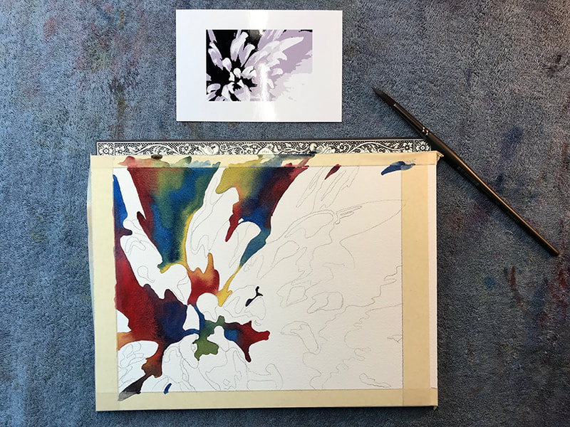 I work with a reference photo which I will turn into a black and white so I can view the values better. My technique uses four values, white being one of them. I'll sketch out my subject and prepare my paints. In this painting I've decided to paint in my dark values first. 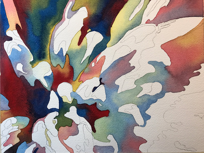 Here's a larger photo so you can see the blending of values. 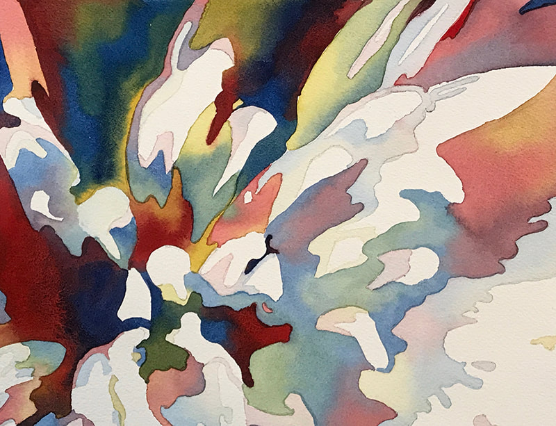 There... finished up by adding the light values being careful to leave the white value shapes. This technique creates an abstracted realism look. Beautiful shapes and distinct values. I find my paintings show much better on the wall with a bit of distance between you and the painting. Up close its colorful with fun shapes. Look at the next completed and framed photo. 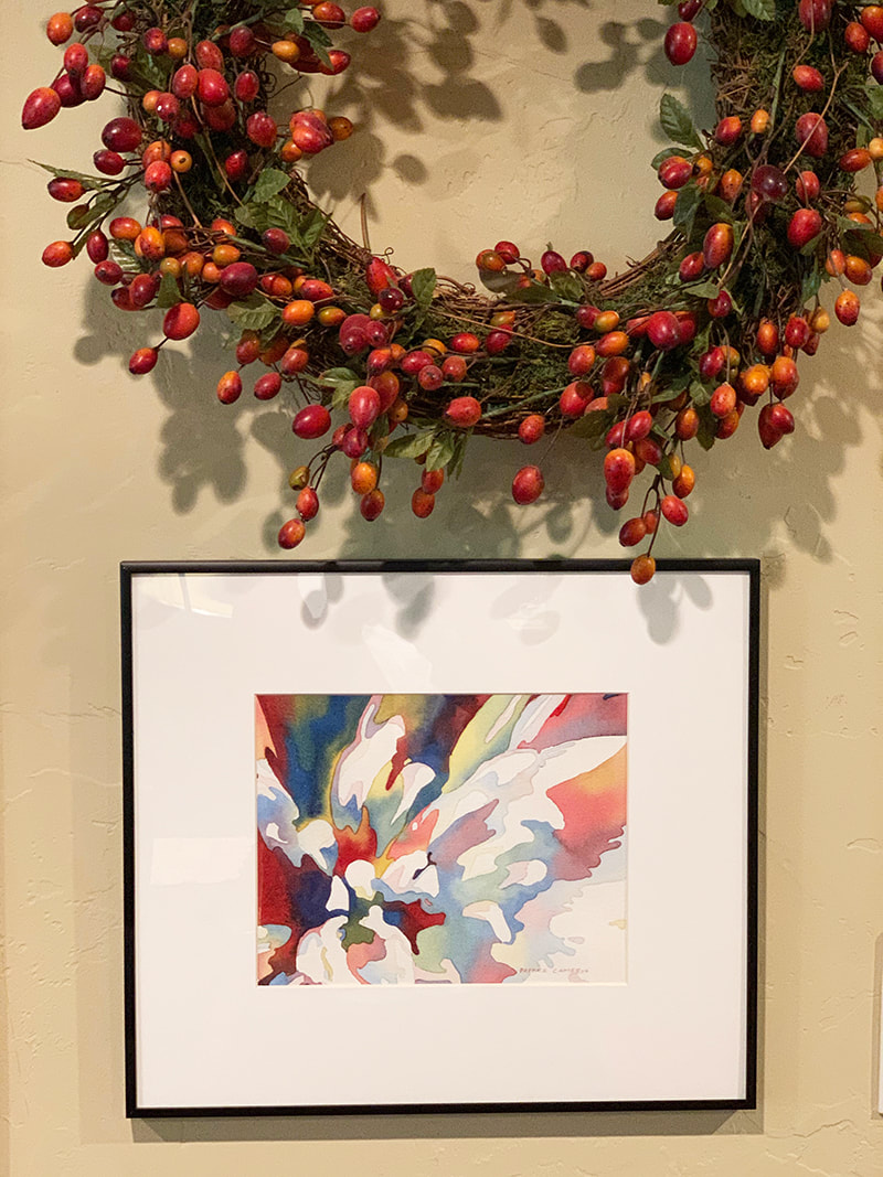 There you have it! A perfect sized colorful dahlia for that wall space! I made this look really easy. This 6 inch by 9inch painting probably took me 4 hours to completion. A 22 inch by 30 inch painting may take me 30+ hours to complete. Lovin' every minute of it too! I've been working on more ideas to write about and there are so many good ones I'm not sure which will come next. Stay tuned, my friends!
Many of the paintings I have been showing are available through prints on my website and some originals are still available too. Contact me if you are interested to view or would like more information on pricing. Thank you for your support and referrals. www.patricecameronart.com [email protected] Patrice
0 Comments
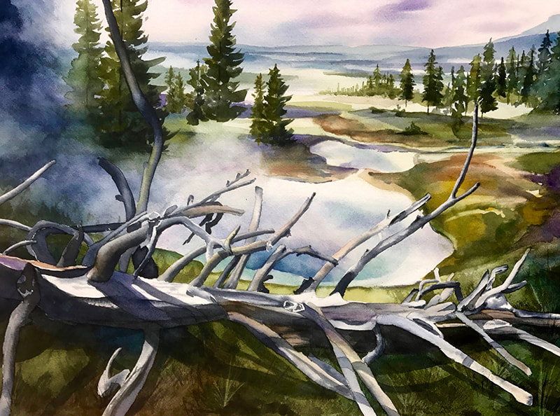
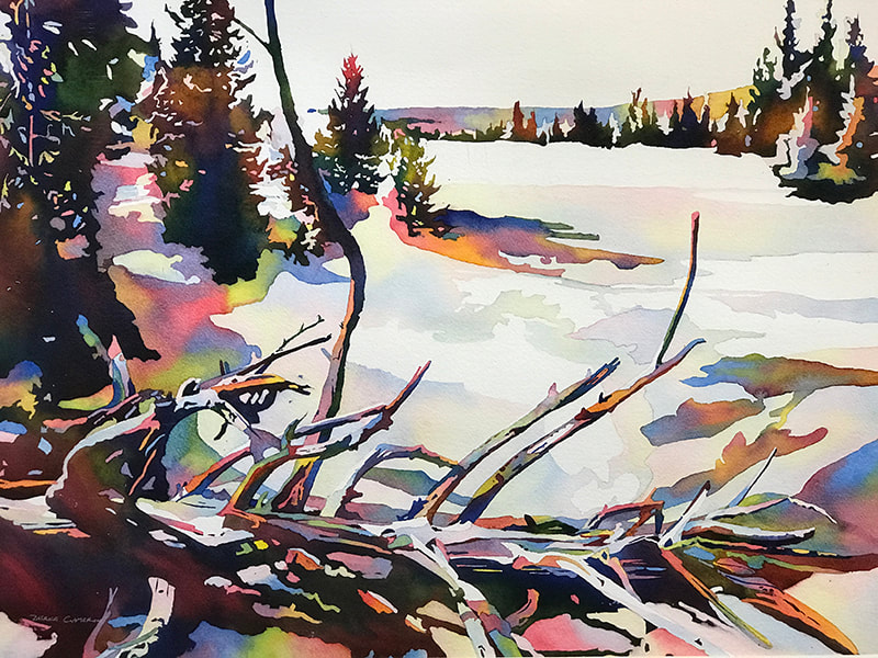
Artistic Risk & Growth.....Risk. What a downer of subject material. But alas, you are reading this subject written by someone who actually enjoys constant change! Ask my husband...I'm frequently changing the dishes, moving artwork, rearranging furniture... and I've been known to move bushes in our landscape to create different looks. Yes, I like change. And then I go into the studio and you might think I'd be all over the place with my creations, but no...I'm thoughtful, directed, and open to inspirations. Perhaps loving change doesn't equate to embracing risk? Life is risky and sometimes my trials work out and sometimes they really don't. Maybe it's my reactions, post risk that are more interesting. Another story. Look here...I'll show you a success: Mid 2017 I completed this Yellowstone painting( left ) in watercolor and a realistic approach. I very much enjoyed this composition and the feeling of the painting. A summertime portrayal. In late 2018 I re painted the same composition in my new style. Whoa... a very different look and feel...more winter and abstracted in shape and color. Changing my style was a risk. Glad I took it. Didn't intend to improve on an already nice painting, but the newer style (right) took the People's Choice award in a local gallery competition. Nice validation. Always wondering...... Next week I'll show you how I paint. Will take you from the beginning to on the wall in frame, completed.
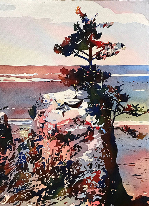
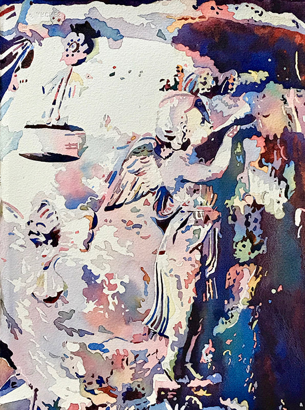
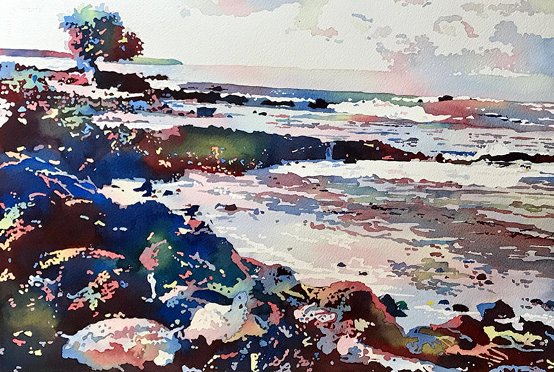
Am so grateful for all of your comments on my posts! Makes me want to keep writing :) Thank you for your continued support and referrals. www.patricecameronart.com [email protected] Patrice The Significance of Titles.......this is pretty interesting for artists and actually helpful for art appreciators (that would be you). :) Many artists will develop the theme of their painting and create the name first. They then proceed to create, keeping their title in mind, which gives them direction and flow. Some artists will use the title to help explain the meaning of their work. And there are those who prefer to "Untitle" their paintings. Some merely use numbers. It's also important to note here that those who enjoy art do not have to define what they see or draw conclusion or understanding. Enjoying art for the visual entertainment, emotional pull, or love of color and shape is enough! Titles may give insight into what the artist was thinking when they created their art. For me...the title evolves as I work through my painting. An idea will usually start percolating and meaning is assigned. In this way, I am connected deeply to my art! My titles can capture the essence or story. These are the topics I will discuss with those viewing my art at exhibitions. Each painting is uniquely special to me, a part of me. I enjoy sharing this with potential buyers or appreciators. Lets look at the painting on the left...I have titled this "UNLIMITED POSSIBILITIES". I have many times driven by this improbable tree growing in the rock outcropping, on the Oregon Coast. This symbolizes strength through hardship and resonates deeply with me. The large urn on the right is titled, "ANNOUNCING JOY" and was painted a few days before Christmas as I anticipated the homecoming of my son, daughter-in-law, and grand dog. A lightness in my heart is expressed in this piece. "SEAS THE DAY".... Yes, a play on words but I was in Hawaii at this time and living each moment, as one does on a tropical island. Back in the studio, and while painting, the essence of that time filled me with realization that appreciating life is not saved for vacations!
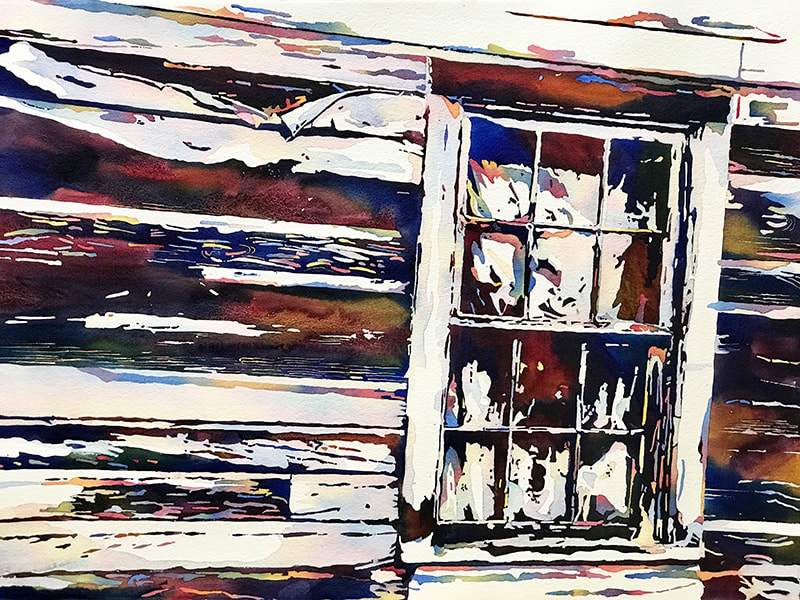
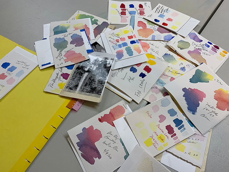
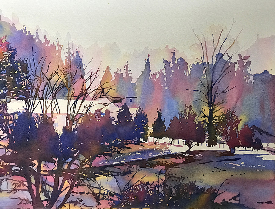
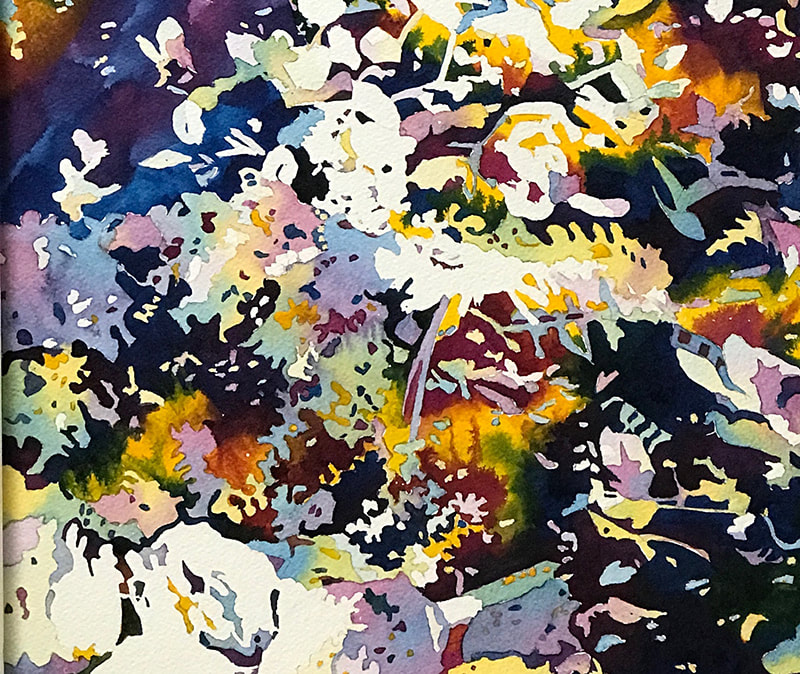
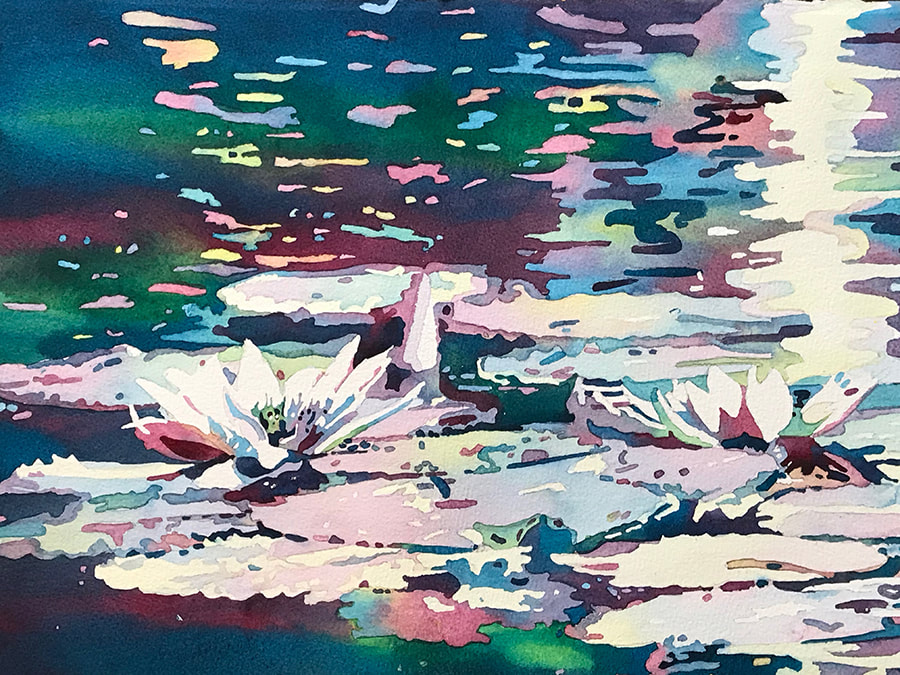
Ahhh...this beauty on the right: I was exploring the antique shops in an old Oregon country town when I walked passed this deserted building. I'm blessed as an artist, to see more than what is there. The window held my fascination and within minutes I could see this new house filled with life and occupied by the generations with laughter, growth, and happiness...til present. Abandoned, but well used. I titled this painting "ANCIENT LIFETIMES". "Color Play".....I developed my present watercolor painting style back in November 2017 and determined I would obtain a cohesive color palate utilizing just three primary colors (triad)...red, blue, and yellow. They produce the secondary colors of purple and green. Sounds easy and straight forward, no? These past two years I have created some astoundingly beautiful color combinations and have also made some very yucky muddy blends too. I had the wherewithal to document every single triad combination. The plot is going to thicken a bit because I soon discovered different brands of watercolor paints produced differing results. I found this fascinating... and promise not to be a bore. Stay with me. Here are a few of my color cards for recent paintings. I staple the reference photo onto the back of the card as an easy identification of the colors for each painting. Right, are the various color combinations I've come up with. Each triad can be a blending of warm and cool colors, only warm and only cool. I have favorites but every trip to the art store, or catalog viewing, has me looking for the next perfect pigment! Let's look what pigments can do. Left, the paints I choose are not as saturated (intensely pigmented) as the painting sample on the right. When choosing, I think of what outcome I want for my painting...the painting on the left is softer like an early morning hazy day. Hey...notice the sediment-looking particles in the light blue....that is a characteristic called granulating and can be very useful for texture in paintings. Adds interest. Also interesting in the right painting is how the red paint (right upper and lower part of painting) disperses in the yellow...doing it's own thing. I love that uncontrolled nature of watercolor painting! In the forest sample on the left, the colors I chose created a brown and normally I would consider this muddy in a painting. I painted my darks first and realized this was the recipe I was stuck with, so I made the best of it by popping out pure brighter color...note the peachy oranges, golden yellows, and grey blues. What started out as a mess has become one of my favorite paintings! I'll be sure to experiment more with 'mud' in this manner. And the waterlilies....I wanted the water to augment the pureness of the lilies and went to my 'green-blue' pigment. Again, red (one of my triad colors) combined with green (complimentary colors) produces muddy color... so I chose a 'cool blue-red' to offset the greenish blue. I think it worked well. So...I don't blindly pick out colors and start painting. Working a lot with pigments and acknowledging their characteristics helps me to choose wisely and obtain the results I see in my mind. Whew.... I hope that wasn't boring. I get carried away with all this watercolor stuff!
Next week we'll be looking at a topic that has more meaning than we give credit to.... Painting Titles. I appreciate your business and referrals! Thank you, www.patricecameronart.com Patrice |

 RSS Feed